

Background:
Anomaly detection algorithm results are provided to users through a scattered group of dashboards and excel sheets.
Solution:
I designed a B2B enterprise platform that keeps track of anomaly detection for various vehicle features.
My Role:
UX Researcher, UX Designer, UI Designer. Collaborated with product owners, project managers, solutions architects, front end developers, internal stakeholders, etc.
Pain Points:
-
Fragmented Information Sources
-
Time-Intensive Process
-
Hidden Nested Services
-
Accumulating Technical and Design Debt
Duration:
MVP Release: 6 Months
First Iteration: 3 Months
Second Iteration: Ongoing
Success:
-
CVDOS process flow integration was a big win.
-
Nested service requests doubled.
-
Positive user feedback led to higher adoption of Query Builder.
*To comply with my non-disclosure agreement, I have obfuscated & redacted confidential information in this case study.
Problem Statement
Vehicle anomaly and fault detection algorithms reduce up to 2 million in warranty costs for Ford Motor Company. Our team supports these algorithms, with the primary users being feature system engineers who monitor and report recurring faults to respective feature teams to preempt warranty issues.
Pain points in the process:
-
Fragmented Information Sources
-
Time-Intensive Process
-
Hidden Nested Service
-
Accumulating Technical and Design Debt

Fig. Affinity Mapping based on stakeholder reviews and initial user research.
Pain Point 1: Fragmented Information Sources
-
Users were required to consult multiple fragmented data sources (dashboards, Excel sheets, and a separate system known as CVDOS) to access essential data.
-
This process was inefficient, involving repeated communication between users and our team when information was missing.

Fig. User journey mapped based on data captured from exploratory user interviews. The low points in the user journey were 'areas of improvements' for us.
Pain Point 2:
Time-Intensive Processes
-
Navigating numerous resources led to considerable user frustration and delays due to extensive back-and-forth communication.
-
I spearheaded many brainstorming sessions for the team to discuss the existing user flow and possible points of improvements where we can reduce time and effort required for certain user tasks.

Fig. One of the many iterations of the user flow
Pain Point 3:
Hidden Nested Service
-
User research revealed that an essential dataset provisioned by our team 'Feature Usage' unknown to some user groups, forcing them to manually retrieve and process data directly from the root database.
-
One subsection of the user base was facing longer task completion times due to this issue.

Fig. A secondary persona I created depicting users that needed 'Feature Usage' data but were unaware of its existence in our portfolio.
Pain Point 4: Accumulating Technical and Design Debt
-
Maintaining multiple dashboards and managing continuous user-driven modifications increased our team's workload and operational costs.
-
Patchwork solutions and frequent user interactions via email/chat further complicated maintenance.
-
Based on pain points captured in the user journey I hosted several 'How Might We' sessions with the whole team throughout the process to generate ideas on how to streamline our processes.

Fig. One of the 'How Might We' Brainstorming sessions I hosted.
Designing the New Solution
Fragmented Information Sources

Unified Platform Design
Time-Intensive Processes

Streamlined UI and Workflow Integration
Hidden Nested Service

Improved Visibility and Access
Accumulating Technical and Design Debt

Simplified and Maintainable UI Design
Solution 1:
Unified Platform Design
-
Leveraging insights from comprehensive user research (20 user interviews, through multiple research iterations), stakeholder reviews, and usability tests, our team developed an integrated platform.
-
Through extensive negotiations and collaboration with the CVDOS team, we successfully integrated their processes via APIs, resulting in streamlined data access and significantly improved user experience.


Fig. Stages of CVDOS flow integration in our product. From 30+ fields for users to input to 3 separate pages with 4-5 input fields on each page to make the task more user friendly.
Solution 2: Streamlined UI and Workflow Integration
-
Addressed the complexity of user-entered logic conditions, initially managed through extensive SQL coding. Although our engineering team developed a simpler custom language (FCL), usability tests indicated significant adoption challenges.
-
Advocated strongly against persisting with FCL by providing clear data-driven evidence on poor user task completion rates, leading to the adoption of a more intuitive 'Query Builder' tool, eliminating the need for users to write complex code entirely.
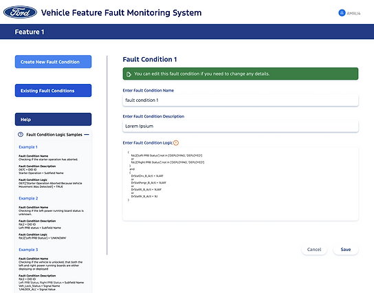


Fig. FCL (Fault Condition Language) created by our team so users don't need to write hundreds of lines of SQL code.
Fig. Query Builder solution was received positively by users
Solution 3: Visibility and Access to Nested Service
-
Developed secondary persona to capture specific user needs previously unmet by the 'Feature Usage' service being hidden from certain user groups.
-
Collaborated closely with internal subject matter experts to introduce accessible options (e.g., clearly labeled radio buttons with explanatory guidance text) enabling users to seamlessly access previously hidden service.
-
For niche user groups whose requirements couldn't be economically fulfilled within our platform, provided clear, actionable guidance, including direct links to alternative resources and root databases.

Fig. Provided 'Feature Usage' data related flags
Solution 4: Simplified and Maintainable UI Design


Fig. Initial wireframe of the the primary form
Wireframes were tested with members of a user+ stakeholder team to test waters.

Fig. First design iteration of the the primary form
Closely collaborated with dev team to understand FCL coding language and developed 'Help' material for users.


Fig. Second design iteration of the the primary form
User feedback to the 'Query Builder' tool was hugely positive.
Fig. Final version of the the primary form
The final version was a minimalistic, easy to use design with easy access to both services our team offered.
Next Steps
Post MVP-Second iteration of the product is currently in dev phase, slated to go live in June 2025.

Success achieved so far:
-
The CVDOS process, while challenging due to its API integration complexity, was a significant win for our team.
-
User awareness of 'Feature Usage' data product is growing, with request being doubled post-MVP launch.
-
Positive usability test results for 'Query Builder' have prompted two additional portfolio teams to adopt the tool.
Fig. Dev Hand-off Ready for MVP Full Flow